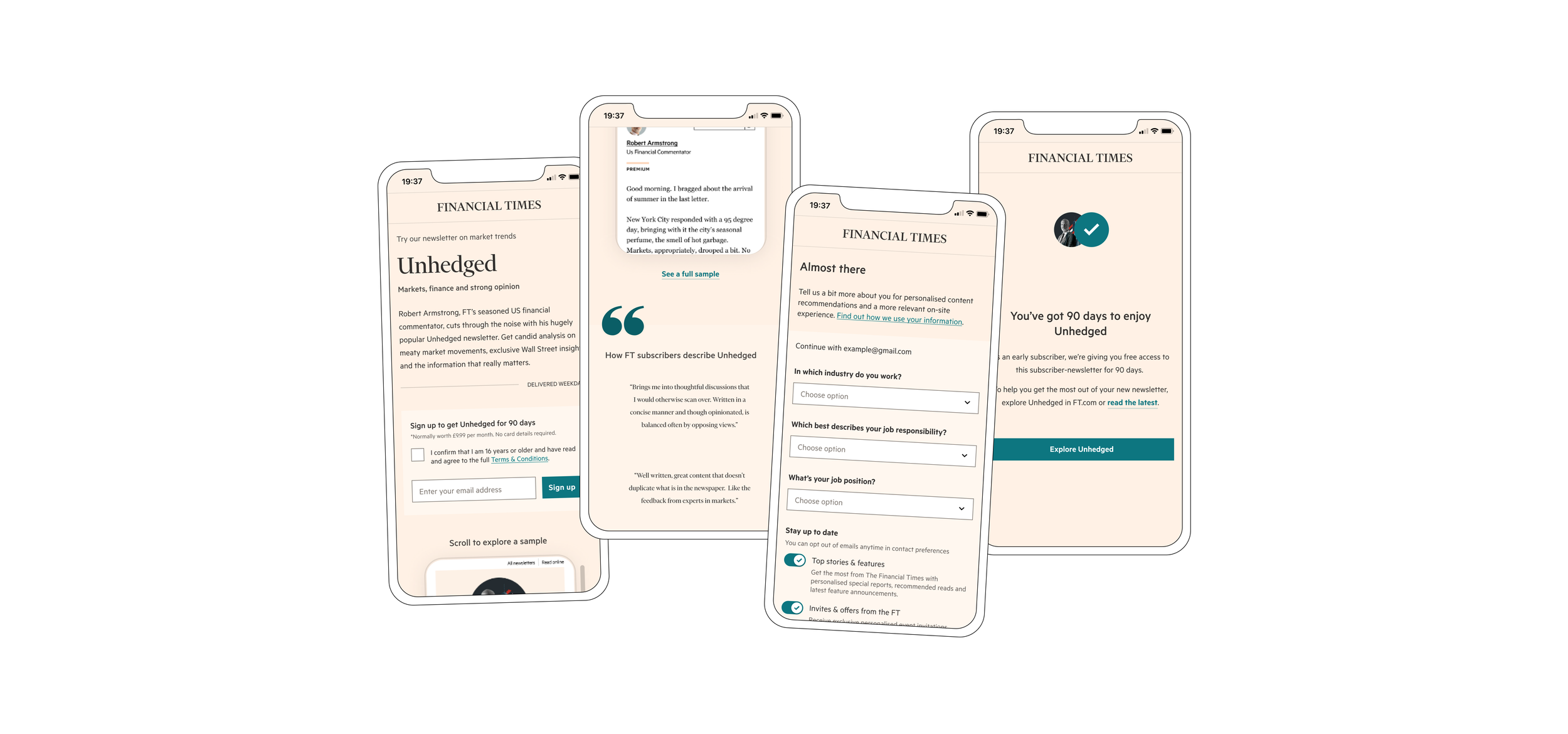
Validating niche subscriptions and exploring growth at the FT
Role
Over the last couple of months of 2022, I led design, defined user experiences through prototyping and testing and collaborated with stakeholders.
Team
Martin Fallon - Product Manager
Jordi Bueno - Engineer (part time)
Me - Product Designer (part time)
Outcome
So far, we've been able to prove that there is demand with 'like audiences' and our hypothesis that a high-value job-to-be-done would be more successful was correct.
Process
Understand
Explore
Validate
Iterate
Test
Desktop; web; anonymous user
PROBLEM
Despite valuing the quality of FT journalism, users often cost mention the high price point as a reason to not subscribe or when cancelling an active subscription.
How might we package existing content that has high value for users at a lower subscription cost?
UNDERSTAND
Context
What are ‘niches’?
Packaging generalist content will not get new audiences to pay, especially within the UK. Even though FT coverage may be of higher quality, there are plenty of free sources to get “good enough” coverage on general news and similar topics.
Content with higher value JTBD like investing or exclusivity (i.e. niches) would be more likely to attract and convert new audiences.
What’s the high level goal?
To find product-market fit, we first need to identify our target audience by drivings sign-ups and then focus on engagement. Over time adapt the product, iterate on the niche and experiment with pricing.
What have we explored before?
Another team experimented with ‘try before you buy’ as part of a newsletter landing page.
Competitors
There are many successful newsletters with different sign up approaches and experiences. In 2022 alone, there has been a clear trend in the direction of topic-led growth strategies across both legacy and new media.
To start to understand users expectations and I analysed relevant journeys from a range of email newsletters, looking for common strategies, novel user experiences and differences.
EXPLORE
Initial concepts
Early ideas revolved around creating a landing page, but we needed to learn what ideas are the most impactful at communicating value..
Simple rework: Improve hierarchy and update the previous newsletter based experiment
Embed a sampling experience in the landing page to introduce and explain content with minimal content
Emphasis on a journalist to explore perception and value of newsletter
Utilise existing content tags and link to the rest of the FT site experience
Developing ideas in mid/hi-fidelity: Using patterns and components from newsletter team re-design
UI iterations
Topic tags:
I received feedback to further explore tag UI in order to reduce cognitive load, improve scannability and reduce its interactive impression.
Email frequency:
Insights from an earlier usability test for newsletter sign ups, frequency was key in their decision to subscribe or not. I explored replacing text with icons and letters to later test if it was clear enough to retain trust with users.
Creating a reusable pattern
After re-assessing the design problem, I realised I was actually creating a template that eventually might need to be reusable across the newsletter experience and sign up journeys. I quickly tested a few designs to find which would be more suitable
VALIDATE
Unmoderated A | B usability tests
Research objectives:
Do users understand what they are signing up for?
What impact, if any does the sample have on their perception and understanding of the newsletter?
Which elements that describe the newsletter resonate successfully?
View prototype:
User insights from unmoderated tests on Usertesting.com
What did we learn?
In testing we learnt that current design wasn’t able to communicate the value or effectively describe the newsletter, making content the biggest risk to the success of this project at this stage.
A key difference in the level of understanding the landing page between the two groups was seeing the sample. Scrolling and seeing the sample and skimming content, rather than it being behind a link was more effective at helping users to determine value.
ITERATE
Landing page iterations
Focus areas:
Embed the sample of both desktop and mobile designs
Condense content to reduce scrolling
Include quotes from users describing the newsletter
Targeted copy - use the customer verbatims from feedback mechanisms
Adapting to a change in opportunity:
The pool of registered users was much smaller than we had initially thought and in order to get stronger signals on the success niches subscriptions, I was asked to think about a journey that could cater for both anonymous and registered users.
Adapting to a change in business requirements:
A wider OKR targeted the creation of '“ghost account”, i.e. accounts created that lack any data and without reviewing any marketing consents. Familiar with the acquisition journeys, I was able to add the additional step as required.
Key landing page explorations:
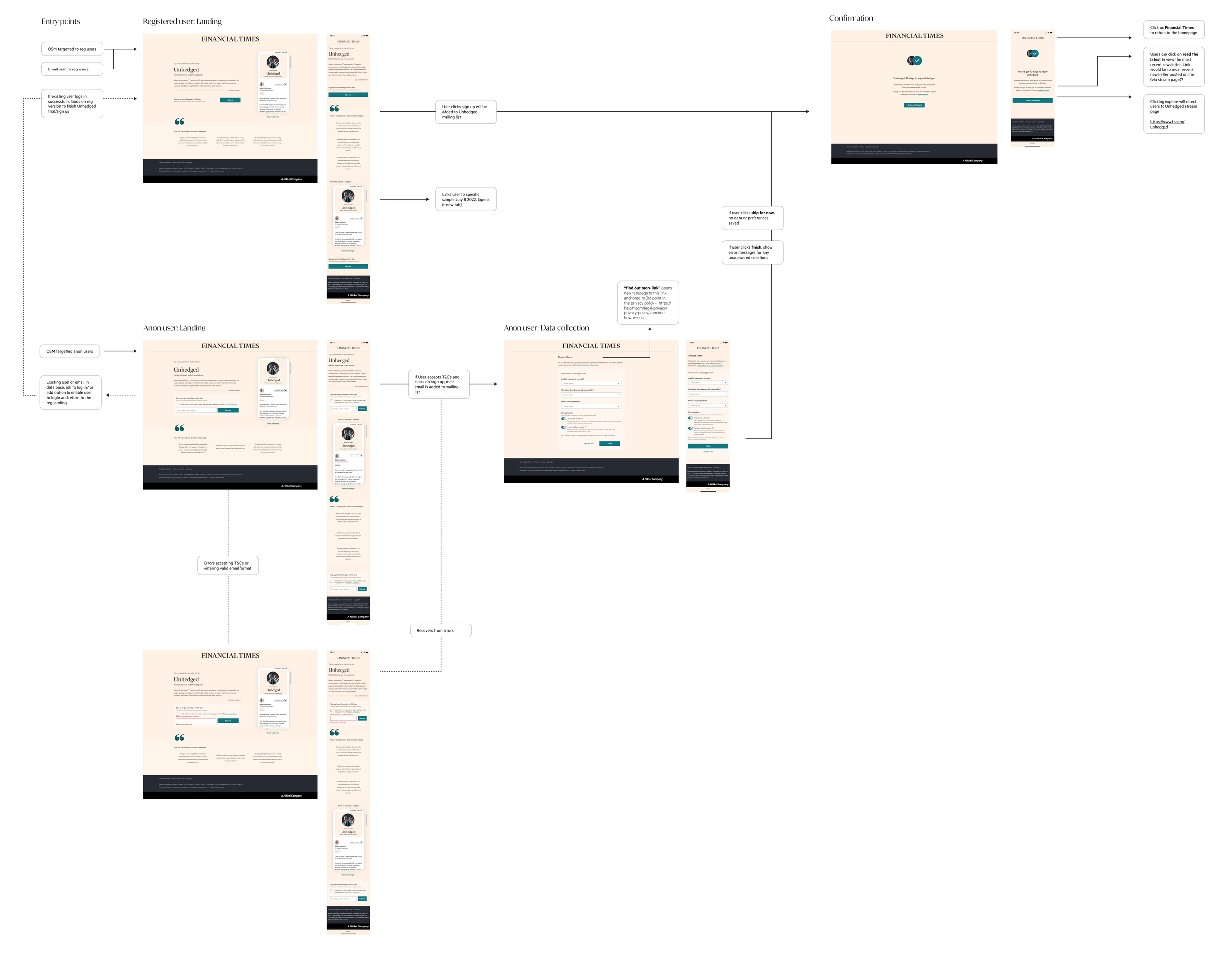
Final flow
As designs were finalised I had some final questions regarding entry points and if we were able to be strategic about who would see any promotions for specific newsletters.
Can we target based on:
Previous article views, article saves and article shares of the same core topics?
Past FT subscribers who downgraded to standard subscriptions?
Follow related topics in their myFT account, for Unhedged this would be linked to Finance, Markets, US Market, Opinion for example?
Viewing the online version of a newsletter from a direct link without an FT account?
Unfortunately we didn’t have the time to connect with relevant teams to have dynamic pages for different users across the FT experience. Instead choosing to directly target registered users with an email and utilising an existing platform to quickly promote the newsletter to anonymous users.

TEST
Impact
A few bugs and QA jira tickets later, the journey for registered users was live and we've been able to
Prove the demand with 'like audiences'.
Prove that a high value job-to-be-done, in this case investing is more likely to appeal as a niche subscription as Unhedged, an opinion based finance newsletter beat Inside Politics, a British politics newsletter, on all key metrics.
There have been further technical complications in the sign up journey for anonymous readers and so we haven’t been able to prove any demand or use data from amplitude to see how users have been interacting with the journey.
NEXT STEPS
What would I have done next?
With strong signals for registered users, it would be important to review tracking and event data to understand how users have been moving through the experience. At what points are they experiencing friction? How can we look to improve the overall experience? How can we retain users after signing up and keep them engaged?
Putting the live design through qualitative testing would identify how to further tailor the experience and get answers to some of the questions above.
An even more exciting question, what does the onsite experience look like for niche subscribers? I naturally had started thinking about this in very early iterations of the confirmation step, wanting to encourage new users into myFT ecosystem and personalising their onsite experience from the very beginning.
Reflections
Important lessons learned:
It was difficult supporting a team, that moved very quickly compared to my other projects, on a part time basis as it was harder to digest and process information whilst context switching. It made me feel as though my impact was limited to UX and UI rather than product design as I wasn’t involved in any of strategic stakeholder discussions or decisions.
I’ve started picking subtle traits from individual designers and our natural inclination to put parts of yourself in the projects you work on. I think being able to be objective and adhere to guidelines is important to create a consistent visual experience for our users, which could mean bending my personal “style” to meet someone else.
How I would approach the same task:
Due to the speed at which the project progressed (this was quick compared to other projects at the FT) I felt pressured by the business goal of being able to validate the growth opportunity as quickly as possible. If I were to undertake the same project again, I would invest time on outlining my process to be clear and aligned on the levels of risk to manage expectations.
Despite collaborating with an engineer throughout the process, I think by seeking out information about the code base I would be adding to, could help relieve frustrations down the line. There were a few hiccups around alignment to grids, padding and mismatched font styles that could have been avoided.


