Enhancing the dining experience with a seamless menu tool for Mealmate
Role
I was initially tasked with developing the branding and delivering a conceptual prototype. Later supporting the founder through with design and early development stages
Team
Jordan Hales - CEO & Founder
UtoR - Software Engineers
Me - Digital Designer
Outcome
After securing investment, a partner tool and client app were developed and reviewed by the team. Unfortunately project stalled and we returned to our “day jobs”.
2020
Desktop; web; anonymous user
PROBLEM
Restaurants aren’t able to easily communicate allergens and dietary information across their menus, negatively impacting the eating out experience.
So, how might we help to users to feel more informed when they eat out?
PROCESS
-
Audit
-
Visual identity, concepts, prototype
-
define ideas, collaborate
-
handover
-
next steps, research
EXPLORE
Starting point
The Client had already a created website with a demo restaurant which outlined initial requirements of the proposed app. I reviewed the site and noted key areas that I could improve
UI and other visual interactions
Refine and validate user flows
Implement defined branding to inform social media channels
IDEATE
Developing a visual identity
Fonts
Existing fonts on the website built on an online website builder - limited selection, used monsterrat
Colour palette
Creating the first prototype in a day, I started with finalising a colour palette and font guide, stressing that having a consistent digital image would be imperative to their credibility as a start up. I chose fonts and colours that looked friendly and would resonate well with such a the broad range of target users.


Updating the Logo
There was had an existing logo but only at a single file size. I updated the logo focusing on making it more modern and offering future flexibility by creating several colour-ways for future use.
Initial concept prototype
I presented an app walkthrough of a concept derived from the demo restaurant website experience. Without strong signals of what Jordan was expecting, I thought this would be an effective way to communicate potential and product vision.
This was also a good exercise for me as I was just had fun with playing with UI without really considering how it would be used.
ITERATE
Defining a MVP
After securing investment with the support of the initial concept prototype, we approached UtoR to help build the customer facing app and web based restaurant partner tool.
The next important step was to define MVP functionality. Without any research to help inform how to move forward, I provided a process to gather user stories through a typical user journey. This helped to capture missing steps and encouraged Jordan to consider the end-to-end experience and helped reign in ideas.
Key decisions:
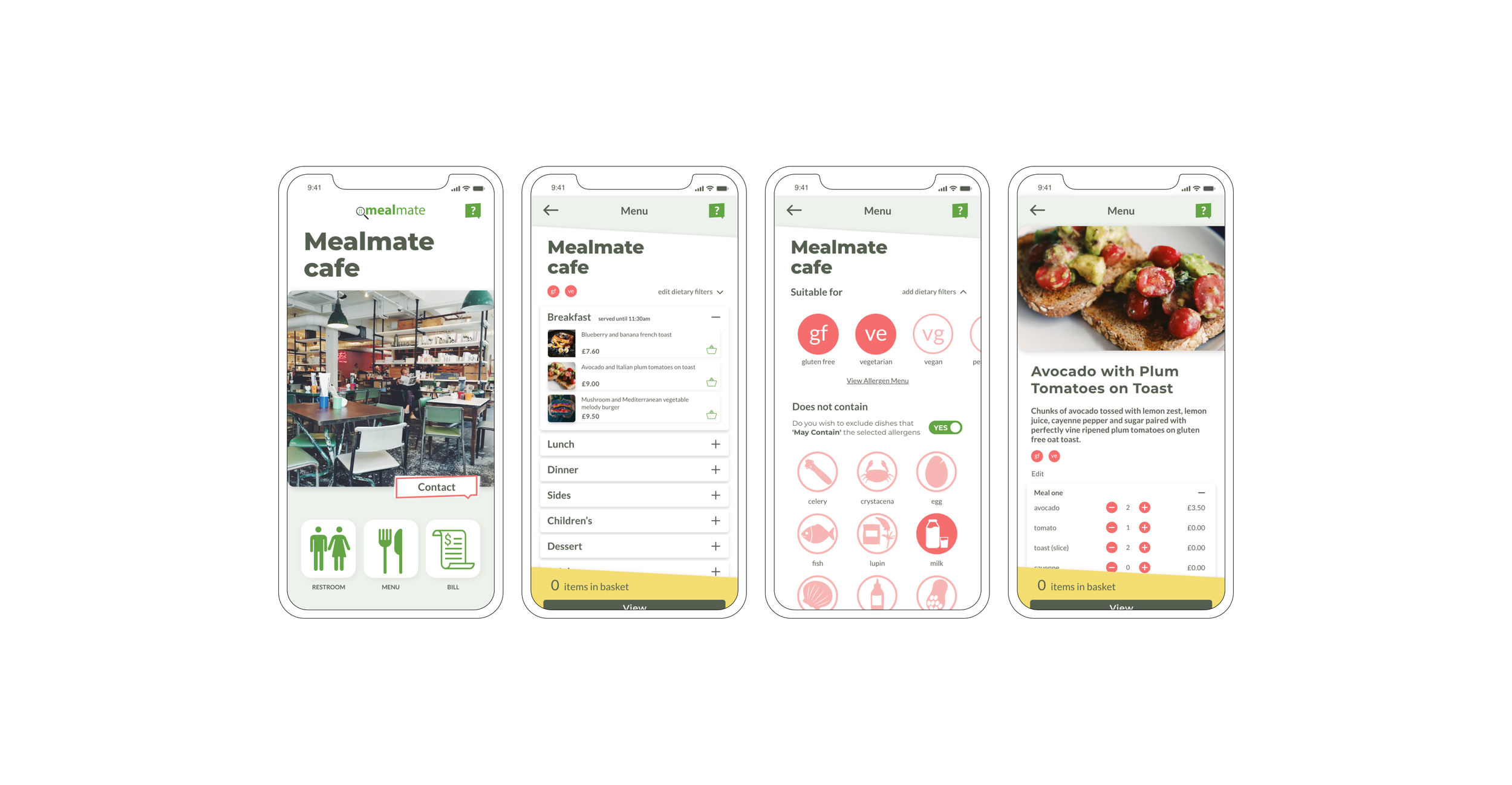
Dietary & Allergen filter
Enabling users to find meals and restaurants that best cater for their dietary preference.
Icons were a great way of conveying lots of information at once, enabling a majority of users are able to quickly visually confirm their selection.
Contacting staff
In light of Covid-19, users need a contactless way to contact their Server from within the app. A contact feature was to be included within the MVP, with future plans to develop functionality in later phases.
Collaborating on product decisions
With better understanding of user journeys, I revisited the designs of key wireframes. Jordan and I spent time discussing key screens, working together to refine UI and decide on final functionality.
I was really excited to revisit how I had used colour in the overall design of the app, spending more time considering how colour alone could be used to correspond with specific actions available to the user.
Restaurant table / homepage:
Adding icons to the buttons to make key actions more easily identifiable
Improving UI by adjusting padding
Uncertain about the “Contact” buttons success as it the label isn’t clear.
Allergen and diet filter
The use of icons work well in both wireframes, however it was important to include the restaurant specific allergen menus for full a more assured user experience.
A key change of language was a suggestion from Jordan, we wanted to cater to range of severity and give the choice back to the user and how to convey “grey area”.
Menus
Considered what users might actually find useful to see when looking at not only a QR menu of a restaurant but the physical menu too. Here I considered:
The photos of the restaurant interior were unnecessary at this point, users have already selected a restaurant so the focus should be on the menu and the food. Confirmed with a “quick user test” (asking my flatmates).
The necessity of the progress bar. Initially it made sense, as the app followed a linear process, but this was replaced by page titles to inform users where they were within the app.
Adding a fixed basket at the bottom of the screen.
Tailoring a meal
A key element of the MVP was allowing users to tailor their meal to meet their dietary preferences without the need to interact with a restaurant staff member. Here I considered:
What if more than one person at a table wanted to order the same dish and how they could go about tailoring their meal
Including visual reminders of dish dietary suitability, if it could be made gluten-free for example
As functionality had increased, I scale down the image frame to make space for the meal editor feature.
DEVELOPMENT
Giving feedback
Jordan approached a UtoR, a software development service that could provide design and end-to-end development of both the online tool for restaurants and a mobile app for users. I was also asked to assist in the app design as I had a good understanding of the product requirements and existing branding.
UtoR’s initial proposal

Giving feedback was a great exercise and experience for me as I removed my own bias and attachment to earlier ideas and focus on the needs of the user and business goals.
Navigation: It’s a great introduction to the overall UI but the restaurant page becomes redundant. By incorporating these icons with clearly labelled actions across all restaurant pages could simplify the experience for the user.
Use of colour: As the website and social media content content established, we wanted to avoid deviating away from the existing hierarchy of colours in the palette as the designs feel disconnected.
Spacing: The inconsistent padding lends to an awkward visual experience. I asked if they could either reduce the vertical padding and align content to same margins.
Scale: The arrangement and sizes of some of the elements on the page feel slightly off. With an app that’s launching for the first time, it needs to feel familiar and comfortable for the user from the outset. From the buttons being too big to the awkward QR frames around the navigation icons.
The designs from the development team prompted Jordan and I to further question our understanding of the product. There were clearly elements that we felt didn’t work, however suggesting changes presented another challenge, as we were not sure of all the limitations that the developers face creating the MVP, including time, budget and skill level.
Misalignment
It was challenging working remotely as often the small details and feel of the product were missed in meetings. Jordan and I didn’t have the time to go through every screen, redesign and then send back feedback to have the developers design it all over again.
To solve this I combined elements from earlier iterations with the proposals from UtoR. Jordan and I were then able to communicate what we felt worked, didn’t work and why. By merging our ideas and simplifying the UI, we hoped the UtoR’s development team would be more confident in being able to meet our expectations.
Exploring layout variations:

Jordan signed off on the final designs and we were waiting on seeing demonstrations before approaching Apple app store and Google play store. Despite feeling that the overall UI could be improved, it was great to see elements of my ideas incorporated into the final design and think about next steps.

The final designs from UtoR:
NEXT STEPS
Survey and User interviews
With the MVP on the way, I started planning how to validate the product and features through user interviews to subsequently inform the roadmap for the next phase. I put together a survey to screen participants and gather some quantitative data.
I completed four interviews using the template below to dig deeper into users’ experiences eating out with an allergy requirement and/or dietary preferences.

Reflections
Product & design
UI First:
It was more difficult to produce something that I felt would could best meet the needs of a user group that I hadn’t even identified. It was a great way to experience the risks of designing without going to users to inform or validate ideas.
It was fun to design with no constraints initially. However many great ideas come from collating inspiration from several sources and product could have come together more efficiently if I had taken time to understand competitor/comparator products.
Stakeholder engagement:
I want to work on better communicating my ideas and the importance of desirability with stakeholders who don’t necessarily understand design, but working with a someone who was a friend first on such a personal project, sometimes got in the way of open discussions.
Handoff
This was my first insight into creating an app that would be going into the software development phase and I was conscious of this while thinking about the small interactions on the page, intentionally reigning in my ideas.
I need to learn more about how my choices impact timeframes and development. Reiterating how having better communication across teams even at the early stages to help inform feasibility and improve efficiency.
Reflecting on this situation made me wish I had been more forthcoming about the benefits of user research before starting to spend time designing and spending money.
Product reflection: Dark mode
Considering that users may often be in dimly lit environments, what can we do to ensure that using phones can be less disruptive for everyone in these spaces.